
Fully customisable Coxcomb Chart with Targets

Link to the viz: https://t.co/r9uDJSfstu
Fully customisable Coxcomb Chart with Targets
It has been a been a while since I last wrote a blog post but the subject of this post has come from a solution I built recently for a professional sports team client (sadly I cannot name). Their request was to build a Coxcomb chart to allow them to compare their own players to the league average of players in a similar position, or targets that they can set. Now normally we would say a bar chart would be a better visual for comparisons or bullet charts for targets, but here the metrics used are not necessarily linked and the client liked the interesting visual a Coxcomb gives and one they felt would spark more interest from their senior management.
Naturally I looked towards the Tableau community for inspiration, tutorials or templates. Yet all that I could find didn’t quite fit the bill of being able to set targets in a Coxcomb chart and also they didn’t feel right for passing this work across to the client for them to manage. I felt the tutorials and solutions were going to be too tricky to understand or maintain – with lots of complicated calculations required and custom image backgrounds.
So I set to work to come up with my own solution that first removed the need for custom image backgrounds and the immediate thought of using Map Layers. I thought; if you could use the data to draw the background then any solution would be adaptable and much more flexible. The other thing to note about Map Layers is they cannot work if you have any Table Calculations – which for this scenario is actually a good thing, Table Calcs in Tableau can be confusing to set up, especially with bespoke visuals. The client I was working for was not the more adept in Tableau and so any simplification I could create would be an advantage.
So I set
about to developing the following solution.
Before I go
into the build of this solution, I will say that the linked workbook (below) has
all the calculations annotated within, so if you don’t want to read on and just
pick up the workbook, well, I won’t hold it against you!!!
Link to the template:
The other
point is I won’t duplicate the wording here in the blog and the calculation
images with contain the explanations as to why the calcs are like they are.
So with
that all said, lets start….
Data
As always
we need to just go through the data structure before we can dive into the
Tableau build. For this build I will be using two data
sources (both Excel files). The main
data source contains all the player information, in this case I have collected
data from ESPN about the current Six Nations Championship (Rugby Union). The data is very vertical, with a row for
each different metric per player, per round of the Championship. The data originally was very wide in its format
and I pivoted it using Tableau Prep.
This is a
snippet of the main data source:

The second data source is actually just a single column of numbers running from 0 to 99 (i.e. 100 rows). This is our ‘data model’ that we will use to densify (sometime referred to as ‘scaffolding’) our data. We will join the two data sources (explained in a moment) to inflate our main data source, so that effectively each row of our main data source is duplicated 100 times (once for each row of our data model).
Well, we need to densify our data in order to instruct Tableau to draw curves. We’ll need around 100 points to draw a ‘smooth’ curved line. Note: Tableau actually draws straight lines between each point, but having a high number of points to a curve we draw means that its hard to see each straight line and therefore the curve ‘looks’ like it is actually smooth – when it isn’t. To plot each point on a curve we will need our main data to determine where we plot. So this is why we need to duplicate each row of our main data 100 times.
Here is a picture of the structure of the ‘data model’ I am joining to the main data source:


So how do I join the data?
Actually I’ll be doing this using Tableau in the Logical Layer using relationships. See image below:

A side note here: I do not have to use Tableau Desktop to do this. I could have used Tableau Prep and joined the Main Data with the Data Model before bringing into Tableau, but I didn’t want this densification of the data to be hidden from anyone downloading my workbook and keep it there for transparency of the process. The other point is, this densification will also work at the Physical Layer in Tableau Desktop Data Source pane, with a true Left Join. Any of the three methods would work.
With the relationship join, I created a Relationship Calculation and simply typed the number Zero in the calculation. This would repeated on both sides of the join and forms the common dimension that the two tables will join. Essentially this is creating a column in each that has Zero on every row. Tableau will densify, by saying for every Zero row in the Main Data source join all rows that have a matching dimension (Zero) in the Data Model source. This is how the densification works.
Screenshots of the relationship join and relationship calculation.


Now we have our data and we have densified it we can begin our build of the Coxcomb.
The Build
So here we go, as stated above the explanations of each calculations are written in the screenshots and are in the workbook, so I won’t repeat myself here and make this blog any longer than it needs to be.
So to start we will need to set up some calculations which will form the basis of the build, as follows:
Metric_ID:


a_Player_Values_SUM:
We are summing here because I have decided for the tutorial that the Coxcomb will show the total values of each metric for each player for the whole of the Six Nations Championship. In my final viz, I have created the option to alter this calculation to show the Maximum value scored by a player in any round of the Championship or even their Average score per metric across the games they played. But here we will stick to totals and therefore SUM

b_Position_Values_MAX:

c_Normalised_Plot_Values:

d_Position_Values_AVG:

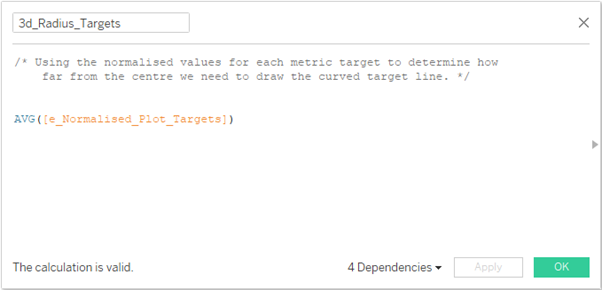
e_Normalised_Plot_Targets:

We now come to the calculations that will form the actual build of the Coxcomb and will refer to the previous calculations we have just seen.
1_Point_Type:


A Coxcomb chart is a radial chart and therefore we will need to build out some classic trigonometry calculations.
Remember our end goal here is to use Map Layers. Map Layers traditionally plot using Longitude and Latitude values, but it is possible to ‘hack’ it (explained later) so that Map Layers use an X & Y coordinate base. We will be using trigonometry to calculate those X & Y coordinates.
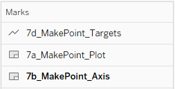
We will also be seemingly duplicating calculations here. These duplicates will form the basis for each individual layer in our Map Layers. We will be building these layers (to start with and more later):
a_Plot – the main coxcomb plot
b_Axis – the background ‘image’ of the axis / range of the coxcomb.
c_Targets – plotting the target positions for each metric.
The Trig.
3a_Radius_Plot:

3b_Radius_Axis:

1. # of Segments (Metrics), Integer, value = 12 (note 12 is the number of segments I want, change this value to the number YOU want in your own viz.
2. Angle Adjustment (Degrees), Integer, value = 90, Range 0 to 360 steps of 1. I set my value to 90 to move some metrics that were poor player performance indicators to the top right of my coxcomb.
4_Angle:

5a_X_Plot:

5b_X_Axis:

5d_X_Targets:

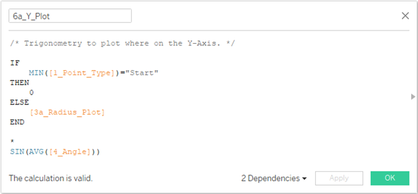
6a_Y_Plot:
6b_Y_Axis:

6d_Y_Targets:

7a_MakePoint_Plot:

7b_MakePoint_Axis:

7d_MakePoint_Targets:

Now for a couple of calculations to help control the colour of the Coxcomb so we can easily see which players are scoring more or less than the Championship Average. The other calculation to ensure the targets will again show up well either against the background colour or the colour of the coxcomb segments.
Metrics (group) - for Colouring:
I actually in my data set have some metrics that are positive (good things for a player to score in) and others that are negative (bads scores). I wanted to reflect that in the colouring of the coxcomb segments, so I created a simple Grouping of the metrics, giving the groups these headers:

Colour_Plot:


Well done if you’ve made it this far now let put all this to good use and start dragging fields onto the worksheet.
Before we do that, lets just reflect on the fields we have just created and try to give a little context to where each sits in our build going forward.

Stage 1: Creating the basic Coxcomb.


- Metric_ID: I selected 12 metrics I was interested in (this will be the number of Segments)
- Pos Desc1: i.e. what position am I interested in. I selected just a single position here, Scrum Half
- Player: Again, to reduce it down I only want to look at a single player, J Gibson-Park.

- Change the mark type to Polygon
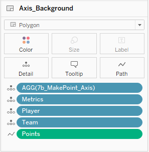
- Drag on all the pills as shown in the image below.
- Take note that Points is set to Path and this is a Dimension.

- Change the mark type to Polygon
- Drag on all the pills as shown in the image below.
- Take note that Points is set to Path and this is a Dimension.
- Change the mark type to Line
- Drag on all the pills as shown in the image below.
- Take note that Points is set to Path and this is a Dimension.


- Colour fill, #f4f4f4 (lightest grey)
- Border, #d9d9d6 (light grey)
- Colour, "Other < League_Av.", #989dae
- Colour, "Other > League_Av.", #666c82
- Colour, "Positive Contributions < League Av.", #a3dbe1
- Colour, "Positive Contributions > League Av.", #54bdc9
- Border, #FFFFFF (white)
- Colour, "False", #323744
- Colour, "True.", #FFFFFF
- Size, 25% thickness (i.e. drag the slider about a quarter of the way from the left)

Take a breather.

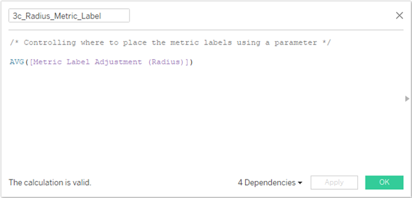
1. Metric Label Adjustment (Radius), Float, value = 1.12. This is just a value I found that works to place the metric labels outside of the the axis, but not too close it overlaps or so far away it looks disconnected.
2. Show plot value if greater than (Radius), Float, value = 0.3, Range 0 to 2. This will form the basis of our control on plot labels to only appear if the plot itself for that metric is big enough. This stops all labels being shown and overlapping or obscuring the view of the plot.


Stage 2: Creating the intermediate level Coxcomb.
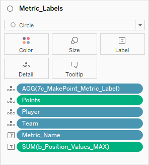
- 7c_MakePoint_Metric_Labels
- 7e_MakePoint_Plot_Values
- 7f_MakePoint_Club_Icon
- 7g_MakePoint_Player_Name
- Change the mark type to Circle
- Drag on all the pills as shown in the image below.
- Take note that Metric_Name and b_Position_Values_Max are set to Label
- Change the mark type to Circle
- Drag on all the pills as shown in the image below.
- Take note that Plot_Value_Label is set to Label

- Change the mark type to Shape
- Drag on all the pills as shown in the image below.
- Take note that Team is set to Shape

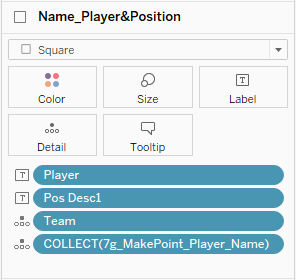
- Change the mark type to Square
- Drag on all the pills as shown in the image below.
- Take note that Player and Pos Desc1 are set to Label
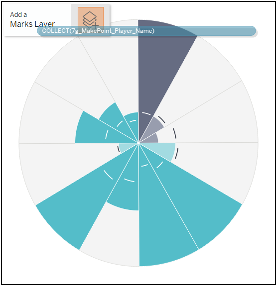
This should now give you something like this (see below) - again it needs some formatting to get it looking polished.

Firstly though, we need to sort out the two axis (Columns and Rows). Our coxcomb chart as it stands is actually being warped by the fact our axis are not the same length. I can demonstrate this if I exaggerate the effect by increasing the length of the x-axis below:

To solve this simply make these changes:
- X-Axis: Fixed Start = -1.325 , Fixed End = 1.325 (total length of 2.65)
- Y-Axis: Fixed Start = -1.15 , Fixed End = 1.5 (total length of 2.65)
This will mean our radial plots will now be completely circular.
Nearly done!
Lets finish off this tutorial with some formatting changes....
Metric_Labels (aka. 7c_MakePoint_Metric_Labels)
- Colour, Opacity = 0%, Border = None
- Size = 0% (i.e. move slider to the far left)
- Labels, Font = Tableau Light, I made the Metric_Name 8pt and b_Position_Values_MAX 7pt
- Alignment = Centre
- Colour, Opacity = 0%, Border = None
- Size = 0% (i.e. move slider to the far left)
- Labels, Font = Tableau Medium, 8pt, #FFFFFF
- Alignment = Centre
Icon_Team (aka. 7f_MakePoint_Club_Icon)
- Shape = apply appropriate shape for your team/club, I used the National logos for each team
- Size = YOU judge it by eye
Player_Name (aka. 7g_MakePoint_Player_Name)
- Colour, Opacity = 0%, Border = None
- Size = 0% (i.e. move slider to the far left)
- Player, Tableau Semibold, 28pt, Right Aligned
- Pos Desc1, Tableau Book, 9pt, Right Aligned
You will then end up with this set up:

And that is it for the tutorial!
Sam
Hi Samuel,
ReplyDeleteFirst of all, good job on writing such a lengthy and detailed post to the tableau template. Well done! I've been looking for a proper coxcomb chart step-by-step tutorial since I have a project I've been working on. I have made a chart in Python that uses 3 dimensions (table columns). It is some sort of pie chart where I'm representing a column using radius, pie slice size to represent another column, as well as color to represent another column.
So far, in Tableau I've managed to create a pie chart where I'm making use of angle and colour to represent two dimensions but I couldn't change the radius in the piechart. I've tried dual-axis but that wasn't enough because I couldn't adjust each slice's radius.
Now, in Tableau I've been having a rough time finding a way to adjust the radius. My research eventually led me to finding out about this custom type chart, so I managed to create a basic coxcomb where I'm using a dimension that is represented by the length of each however I can't seem to plot the other two dimensions.
I'd like to know if it's possible in coxcomb chart to adjust the width of a bar? Also, Is it possible to plot the color based on a certain measure, a continuous value?
Fantastic viz and tutorial, much helpful. Thanks for your sharing
ReplyDelete